Website Design: Corners4 E-Commerce Site Launches
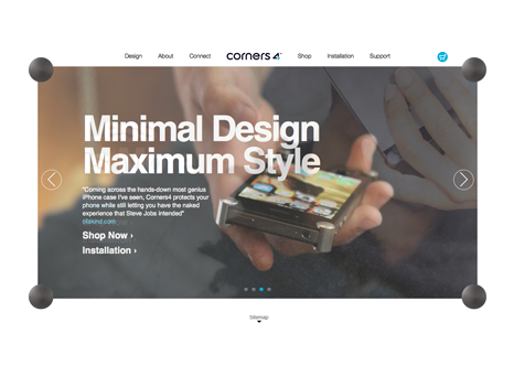
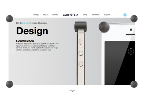
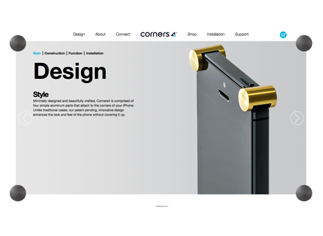
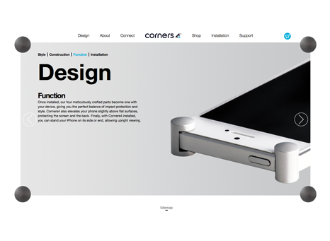
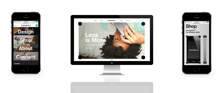
Create Blueprint collaborated with our talented design partner, Permanent Art & Design Group t0 develop a site with for our client, Corners4. The goal for the site was to convey the uniqueness of Corners4 in both website aesthetic as well as in user experience. To accomplish this goal, we conceptualized a browser site to mirror an iPhone with Corners, while structuring the images and pages to shuffle in and out of the static corners on the page. Brand lifestyle imagery and close-up product photography set against a matte background, showcases Corners4 while adhering to its trademark minimal aesthetic.
The mobile experience is designed in blocks for easy access to information while on your phone. The user experience functions like an app, allowing for the user to move around the mobile site effortlessly. Customers can easily navigate their way to the shop page, for quick effortless purchasing of the awesome product.
BACK TO FRONT PAGE »
